I was plotting a dataset with many rows per country as a sunburst chart using Plotly. After joining the countries of the Natural Earth Dataset into my Pandas dataframe, I also had the columns ‘CONTINENT’ and ‘SUBREGION’, so I could do:
import plotly.express as px

fig = px.sunburst(
    df,
    path=[px.Constant("World"), 'CONTINENT', 'SUBREGION', 'country'],
    values='Qty')
However, after using this approach in a Dashboard powered by Dash, the colors used for continents changed depending on the applied filters. This means I had to use fixed colors for the continents, like so:
# Set up dictionary with colors for each continent
cat_colors={}
for i, continent in enumerate(countries["CONTINENT"].unique()):
    cat_colors[continent] = px.colors.qualitative.Dark2[i]

fig = px.sunburst(
    df,
    path=[px.Constant("World"), 'CONTINENT', 'SUBREGION', 'country'],
    values='Qty',
    color_discrete_map=cat_colors,
    color='CONTINENT',
    )
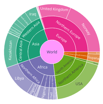
Unfortunately, there is no way to set the color of “World” at this point, it just gets a random color (and in my dashboard, the color changed depending on the filters). I couldn’t find any solution on the web, even asking ChatGPT did not help. After a long time, I remembered that Plotly fig objects are basically JSON; it is easy to inspect the JSON data and to change it afterwards. To set the color of “World” to grey, simply run:
colors = list(fig.data[0].marker.colors)
colors[-1] = "#999999"
fig.update_traces(marker=dict(colors=colors))
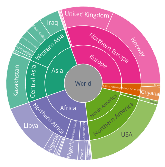
Data: UN Comtrade database, Sources of Petroleum imports to Germany in 2023